Proven Digital Marketing Tactics to Make a Great Website
Every digital marketing strategy starts with website optimization. And, why not? Your website is the first place your potential and existing customers will go to when searching for your services.
So, it’s important that you have a great looking, impressive and easy-to-use business website.
For the past few years, we have been working closely with local businesses, startups and SMEs from around the world, providing consulting, strategies and solutions related to proven website marketing.
We help businesses understand their websites’ performance in search engines and market, identify the areas for improvement and come up with the best digital marketing strategies to help achieve the desired results.
If you’re here, you are probably wondering the same things as many other website owners like you do, such as:
What are the things that make a website get more leads or sales?
What’s the best web design to make users stay?
What’s the best way to manage navigation on big websites (with a large number of pages)?
What makes a great website?
If you have similar questions, you will find all the answers here. Today, in this article, we will discuss the top digital marketing strategies to make your website stand out from the competition.
So, without further ado, let’s get to know the Key Points that can make your website better than others.
“DESIGNS are supposed to look GOOD, but they MUST also be able to CONVERT TRAFFIC.”
Website Layout
The layout is all about how the various elements, design and content on your website are structured. The simpler the website layout, the easier it is for search engines and users to navigate through the web pages.

Keep the important content above the fold
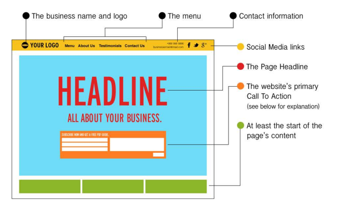
The fold is the section that is immediately visible when a user visits your website. This must contain the page Headline and a Call to Action.
‘Above the fold’ is the section where your top menu, logo, etc. generally go. Besides these, other important elements to put here include the business name, links to about us, contact us, services (important pages), contact information, social media, etc.
The reason to put the important content above the fold is simple – the higher it is on the page, the easier it is for visitors to see without scrolling down.
Home page layout
A well-designed homepage layout can make all the difference between a poor-quality and a high-quality website.
The ‘fold’ part is where the primary Call to Action of the page should be placed to give users a chance to convert right after they visit and if they like the page. Consider including a slider to make things more interesting for the user.
For e-commerce sites, it’s also vital to include the ‘product category’ list in the Menu or the Fold section so that it’s easily visible to the visitors.
Social media icons
Adding social icons and options on your website pages is a great way to boost interaction.
There are already billions of people on popular social media sites like Facebook and Twitter, who when given the choice might love to follow you on social media in order to stay updated with news, posts from their favourite brand.
Besides helping to boost interaction, adding social links to your site will also help you get more followers, thus improving the overall reputation of your business among the customers.
The most common practice is to place the social links at the top right or left corner of the website, right after the contact information. Sometimes, they are also placed in the footer section.
Besides the icons for popular social media sites, you can consider adding Facebook and Twitter feeds on your website to further boost the interaction.
Phone and Email (contact) Info
Phone and email continue to remain two of the common ways for customers to contact a business or brand. But, where you place these contact elements on your site will greatly impact the level of engagement they can create.
The most common and usually the right approach is to place the contact information in the top right corner of the header section of your website. You can place email address, phone number, Skype, Whatsapp and other options here, based on what is preferred by your customers.

Make the contact options clickable so that users can easily get in touch with you, especially when visiting the website on mobile devices.
Mobile responsive
Google prefers mobile websites over the desktop or web version of websites, so make sure you have a good, responsive mobile-optimized website that works seamlessly across all the modern devices, screen sizes and browsers.
Having a mobile responsive website will also ensure that your site converts well for mobile users, which, in turn, will help drop your site’s bounce rate (the number of users leaving the site within a few seconds).
Here are some mobile optimization practices you can follow:
- Try placing Calls to Action as high as possible on the page
- Regularly test your site on different mobile devices to ensure everything works fine
- Phone numbers and emails must be in clickable format
Calls to Action (CTAs)
Call to Action is how you encourage the website visitors to take the desired action, leading to immediate conversion. Some examples include Contact Us forms, Buy Now button, Lead generation form, etc.

The best location for CTAs
Ideally, CTAs must be placed on every web page that aims to make the visitor take action. It should be the most visible element on the page and designed to prompt the user to convert.
If you are using a Contact us or Call us button, the best place to put it is right after a sales pitch or content.
Contact us forms or email subscription forms are usually added in the sidebar or the slider section on a web page.
Best types of CTAs for your business/website
For local service providers who are not selling online but looking to generate leads, the best Call to Action type is a Contact us or Call us button that makes it easy for the site visitors to get in touch with the business. You can place a contact form in the sidebar of your site so that it appears on all the pages.
For e-commerce sites that want leads to convert into online sales, a ‘Buy Now’ button is the best call to action in any case. Besides that, you can also add a ‘Help me’ or ‘Get Help’ option right on the product/service page to make it easy for prospects to find help when buying a product or service. Other possible CTAs for e-commerce sites are ‘Add to Wishlist’, ‘Add to Cart’, ‘Enter a Coupon’, ‘Get Offers’, etc.
CTA optimization

Irrespective of the type of business, make sure that CTA is the most visible and distinct element on the page, having attractive colour, graphics, etc.
For example, Alibaba.com uses bright colours (orange, red, etc.) to highlight the RTA elements such as ‘Contact Supplier’.
Website Navigation Optimization
Navigation is how a user moves through your website or how different pages on your sites are linked or grouped. The simpler the navigation, the easier it is for search engine crawlers and users to navigate through your website.
Use Dropdown Menus

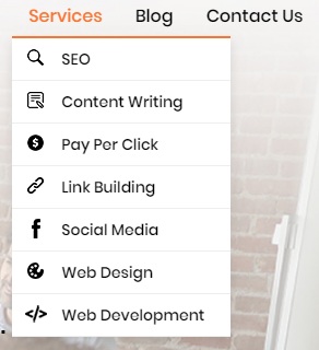
Dropdown menus are the best way to keep the elements on your site clutter-free yet providing users with access to all the important pages right from the ‘above the fold’ section. It also ensures that all the pages on the site are interlinked, making it easier for users (and Google bots) to move from one page to another.
If there are pages inside pages, you can use submenus.
If you are running an e-commerce website, make sure that the pages on your site are organised inappropriate categories and subcategories, which are easily accessible from any page on the site.
Use of Headers
Header or Headline is a good way to distinguish headings in a content. There are different types of headers, namely H1, H2, H3, etc., which are used for different types of headings based on importance and hierarchy.
H1 Headline is used to present the main heading or title of a page, providing a subject for the page content to the visitors and search engines.
H2 is a subheading tag, which is commonly used under the H1 header to present something that is important.
Similarly, H3 subheading tag is used under H2.
When using the header tags, the hierarchy must be maintained to ensure a proper flow of information and to make the content easy to read and understand for users. Also, the heading tags must include your target keywords, as they are used by Google to identify the subject of a page and is a nice tool to increase your ranking for relevant keywords.
Conclusion
Your website is the online depiction of your business. Make sure it’s an impressive one.
There are many other things such as website content, images, URL, interlinking, etc. that need to be optimized to make your website more friendly to both the users and search engines. A professional digital marketer can help you with the job.
Not getting enough traffic or converting enough leads? Contact our expert digital marketing team in Sydney to get a free SEO review of your website and marketing campaign.

