 0
0
 0
0
Do you know what’s the one thing that separates one website from another? It’s the web design. The way a website is designed depicts many things about the company/person behind. It’s what makes your website stand out from the crowd.
The way websites and apps are designed has completely changed today, thanks to the high-end design tools and languages like CSS. CSS is what enables web designers to use their creativity and conduct experiments to try & develop different designs for different purposes. CSS allows you to create a different design than the mainstream.
So, what exactly is CSS and how is it revolutionising the web design/development industry?
Let’s explore.
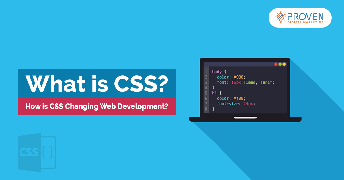
What is CSS?
CSS is one of the three main languages used for front-end web development services. CSS stands for Cascading Style Sheets and is a language for webpage styling. In simple words, CSS is how you style a web page with custom fonts, colours, and other design elements. CSS can also be used to make a website responsive, i.e. make it appear the same on different screens.
Even though CSS is not a programming language, it still holds an important place in web development. Without learning to use CSS, you cannot expect to build a great design.
In short, CSS is what gives a webpage a unique style with images/wallpaper, font styles, size & colour, button styles, etc. Without CSS, a webpage will look like it has no design but only words.
CSS is usually written in HTML language and supports all the standard HTML tags. A normal CSS syntax will, in fact, look more or less like an HTML code. For example,
HELLO
This line suggests that the text written within the h1 tags must be shown in Heading 1 format. And that’s what appears when you run the code.
Now, to assign specific design rules to a particular HTML element in the CSS file, we use a feature called “selector”. It’s denoted by the ‘{}’ sign and used within the same CSS file. For example,
h1 {
Color: red; }
This will imply that the text used within the h1 tags should be shown in red colour. We can use the same selector to assign size, font, colour and other design elements to a particular HTML tag.
CSS can be integrated within an HTML file or can be created as a separate file and then linked to an HTML file. Based on how or where CSS elements are placed on a web page, CSS can be of the following three types:
- Internal/Embedded CSS – When the CSS styling or tag is used within the Section of the HTML file, it’s called Internal CSS.
- Inline CSS – This involves defining the CSS styling or rules for specific elements within the HTML file.
- External CSS – When a CSS file (.css) is separately created and then linked to the HTML sheet, it’s called external CSS.
How is CSS Changing the Web Development/Design Landscape?
CSS, through its advanced tools such as CSS Grid, CSS shapes, writing-mode, custom properties, and more, is drastically changing the way web designs are made.
Gone are the days when web designs were monotonous or inspired by the same theme or layout. Now, thanks to advanced CSS rules & features, you can make the same design look different for different web pages. Or better, you can create new, better designs from scratch using the powerful CSS tools and features.
Here are some of the popular CSS Tools that helped change web design & development.
CSS Grid
As the name suggests, CSS grid is a layout design technique that allows designing complex responsive web designs by dividing the area into multiple grids. Earlier, the same task was performed through tables, boxes, etc. However, as it has been proven many times, CSS grid is a more effective technique for layout building.
There are many obvious benefits of using CSS grid instead of older layout methods and/or frameworks like bootstrap. For one, it makes the job of styling easier and faster. Second, making a grid with CSS is much easier and requires less code than the older methods. And the best part is, the CSS grid looks more awesome and well-managed than any other layout method.
Unlike the bootstrap framework where we had to do with a fixed 12-column layout, CSS grid can be used for creating any custom grid structure in a few easy lines.
For example, if you have to make a 3-column grid in CSS, all you have to do is write the following lines in the selector,
.grid {
display: grid;
grid-template-columns: 100px 100px 100px;
grid-column-gap: 20px;
}
Where 100px is the column width, and 20px is the gap between two columns.
That was easy, even with bootstrap and other methods. But, what if you had to make a 15-column grid or a grid with even more columns? Then, it is not so easy with the older methods. But, with CSS grid, all you have to do is repeat 100px 15 times, and your grid is ready.
In short, CSS grid has made it super easy to build a grid layout on the web, even for non-technical designers and website owners.
Now, it is possible that you may want to create a grid with columns having different widths, which is nearly impossible to create in bootstrap. But, with CSS grid, it’s as easy to build as anything. All you have to do is change the 100px (column width) to any custom width. For example,
.grid {
display: grid;
grid-template-columns: 100px 175px 65px;
grid-column-gap: 20px;
}
The above code will create a grid with three columns, each of different width – 100px, 175px, and 65px respectively. The gap between the columns remains 20px, which also you can change as needed.
Another important aspect of the CSS Grid is the ability to make responsive layouts. Compared to other layout creation methods, CSS grid is probably the easiest way to build a responsive design. There are multiple methods to do that, of which the simplest is to use the ‘fr’ unit in the code. Here’s how.
.grid {
display: grid;
grid-template-columns: 1fr 1fr 1fr 1fr;
grid-column-gap: 20px;
}
Here, fr represents a flexible-width, which means the width of the column can change dynamically based on the screen size. ‘fr’ is actually a fraction and not a fixed length.
The above code implies that the total layout area will be divided into four columns of the same width/size. The column width here is not fixed and will change depending on the screen or the total layout width.
Based on the purpose and use, many other variations of the CSS Grid and CSS Grid responsive (fr) can be created, including different width columns.
For example, it’s also possible to create grids with unequal width columns. To do that in the above example, all you have to do is replace the 1 in fr multiple with another digit. For instance,
.grid {
display: grid;
grid-template-columns: 1fr 2fr 3fr;
grid-column-gap: 20px;
}
The above code will create a responsive grid where the second column’s width is 2 times that of the first column, and the third column’s width is 3 times that of the first column.
CSS Grid also lets you do many other amazing things, such as design height-based grids, position and customise grid items, and more.
Besides Grid, there are many other advanced CSS elements & features that have made life easier for web designers & developers in the past couple of years. Let’s discuss some of them.
CSS Shapes
CSS Shapes was a revolution that taught us how to think beyond regular, rectangle, triangle and circle shapes. CSS shapes made it possible to build irregular shapes with ease.
Imagine a grid layout, where all the columns are not necessarily rectangular or triangular or circular. Imagine irregularity in web layouts and designs. This has been made possible by CSS shapes and ‘clip-path’.
CSS Writing-mode
Writing-mode has also proven to be nothing less than a revolution for web designers of our times. It has made it possible for designers to create text flow in directions other than the usual left to right flow.
This is particularly useful when you’re building a website of any other language than English. For example, Chinese words can also be read right to left and even top-down. The CSS writing-mode feature lets you create web designs with Chinese words.
In addition, the writing-mode feature can also be used for building creative design, logos, etc. with inverted text, rotating text, and text in other than left to right flow.
Conclusion
CSS is so far one of the best things that happened to the web design & development industry. Unlike about a decade ago, web designers today are actually able to experiment with their creativity and build designs in the most bespoke fashion possible, all thanks to cascading style sheets.
CSS has greatly changed the web development landscape in the past few years. Today, web designs are more dynamic, intuitive and user-friendly, thanks to the amazing features & tools given to us by CSS. If you want to know more about how CSS can help you create amazing web designs or need the help of a professional CSS web designer, just get in touch with us at Proven Digital.